🔞 Not Safe For Work content is ahead, please, NO minors! 🔞
Editing In Post
One of the more frequently requested topics, just how do I get things looking the way I do? Well, the answer there is more often than not editing renders in post. One of my biggest goals with editing in post is to make it as easy on myself and as good looking as possible, while being flexible enough to not have to redo everything if changes are made to the render. Luckily, the method I've settled on handles all of these things pretty well. Here I'll go into more detail on the setup and execution of that, as well as other in post edits such as HUD elements.
Use the overview below to jump to the section that most interests you.
Overview
- When to Edit in Post?
- Cosmetics clipping with themselves or with the player model
- Unwanted/unneeded parts of models
- Blending
- HUD Elements
When to Edit in Post?
First things first, we need to decide what even needs to be edited in post. The simple answer to that is, anything that we cannot easily achieve in SFM itself. This answer isn't very useful on its own, though. Here's some examples we could consider:
Cosmetics clipping with themselves or with the player model
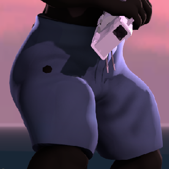
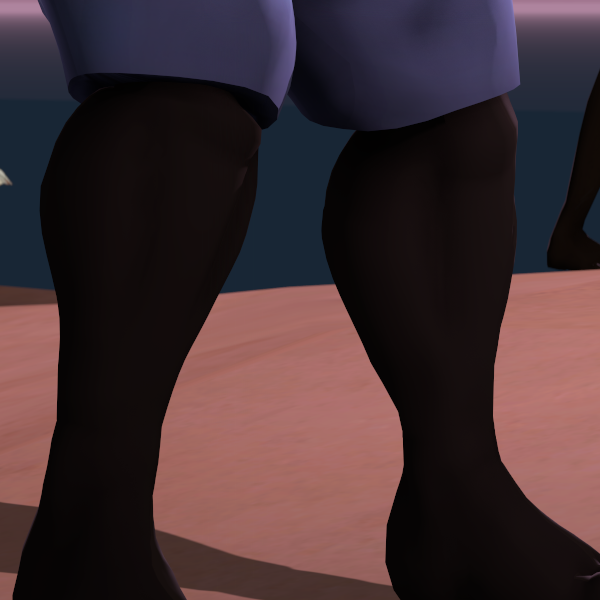
One of the most common issues you'll run into, whether it's with a TF2 setup, or with any other character that has clothes separate from the base model. Sometimes you'll get a bit of the model underneath poking through the model meant to be on top.
When possible, I like to fix this in SFM itself. You can move either the bone(s) of the cosmetic itself, or unlock the cosmetic bone(s) from the model and move the model underneath. Don't forget to relock the cosmetic bones if doing this. This sort of editing is best done when the posing is finalized, otherwise you'll probably have to adjust it again.
Here's an example from one of my pieces, hover over the image to see the before and after. Note that the thigh moves slightly between them, which can be seen above the knee. This is minor and not noticeable to the viewer. If it were too much of a movement that it would be noticeable, then I would consider instead editing this in post.
Of course, sometimes you need to edit it in post to make it work. In that case...
Unwanted/unneeded parts of models
Sometimes you don't want a full model present, or a little part of the model is doing something that would just look better without. What I do in this situation varies wildly. If it's something I expect to reuse, and the edit isn't especially difficult, I usually take the time to decompile the model, edit it to my needs, and recompile a different copy of it. This works, but if you don't know how to edit models, or what you want to do is either too specific or too difficult to just edit on the model, then editing in post is a much better prospect. But, how do you easily remove something like that?
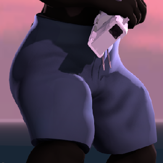
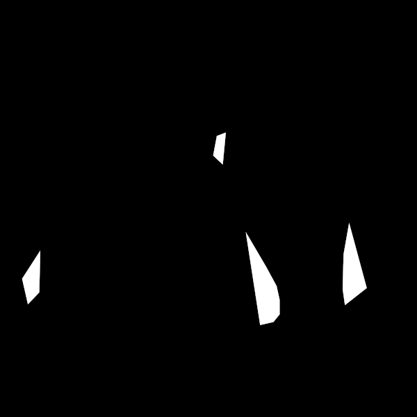
The answer I've found is to render out multiple versions of your scene, with different parts visible and invisible. Here's an example from the same piece before. There's these weird kinks in the legs model. I'm not sure why, they aren't there on the model in the reference pose, and usually posing them is fine. Moving the feet around doesn't get rid of them without them being ridiculously stretched away, same with scaling different parts. So, I render out two versions of the scene. The normal one, and one without the legs visible, like so.
Then in the image editor of your choice (my go-to is the GIMP, though anything more advanced than Microsoft Paint should be usable), open your base render and bring in the other as a layer. You should rename your layers so you know at a glance which one is which. Add a layer mask to the upper layer1. We want full transparency, which in most editors is all black. With the layer mask selected, we'll use a polygonal selection tool to clip off any offending bits. Fill this selection in with white. Repeat as necessary for each offending bit. Your layers will look something like this:
Add Layer Mask.... In the popup select Black (full transparency) with Invert Mask unticked and press Add.In Photoshop: Select the layer, hold Alt, and press
 once.
once.Note in some cases you don't want the full selection filled in. I'll go over more specifics on that in the following section, it's very similar to what's described there, just on the layer mask with white rather than a new layer with color.
Hover over the following example to see the final product vs. the layer mask used to clip the bits off. Compare it to the individual renders before.
One nice thing about this setup is that it is very modular. Say that I wanted the trunks to be red instead, I would only need to rerender the base layer- all of my edits are still usable. If I wanted to change the lighting, I would rerender both parts- but the layer mask is still usable here. However, if I changed the posing on the legs, the edits would need to be redone. No getting around that unfortunately.
Of course, not everything we want to do is this simple. Sometimes we want two or more things that don't really go together at all to go together. Sometimes major parts of a model are just bad looking. What do we do then?
Blending
Then we blend! Basically, we're taking colors from the image and painting over it, usually after we've already done what we can with different renders. Here's an example from an older piece of mine. My Pyro Sage is experiencing a bit of telefragging from an unfortunate Spy. The initial setup in SFM is rough, but with a lot of alternate renders mentioned in the previous section, it looks far better. But, not quite good enough still.
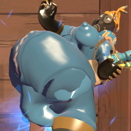
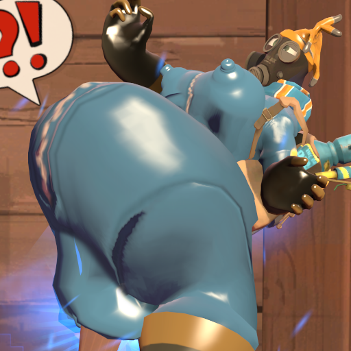
Hover over that image to see the difference. The outer shapes are a lot better, and things look like they're connected much more now. But there's still some weird stretching, and the thigh has more or less collapsed in on itself. So how do we get this looking better still?
First, we want to make a new, totally transparent layer on top of all the other layers. Select the area that you want to edit like we did in the previous section. Take care to only select parts that you want going together, but make sure to give yourself plenty of extra room around the offending area. Confusing? Here's an example selection. I want to fix that shadow between her belly and her pussy. Note that only her body is selected (things like the background and her thighs aren't), but much more of it than just the offending area is included.
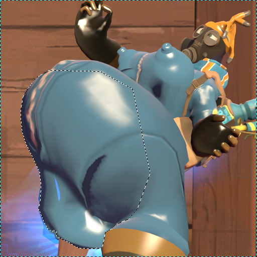
Next, we take our eyedropper tool and pick a color near where we'll be editing. For simplicity's sake, set your eyedropper to Sample Merged. This makes it take the color that is currently under your mouse as you are able to see it, rather than sampling from the layer you're currently on. Then we switch to our paintbrush tool and set it to a circular, very soft brush. I usually have mine set to only 25% hardness. For size, go as large as you can for the area you're in. Large brushes give us smoother results. On the new layer, with gentle, smooth strokes, I start building up the color blend, occasionally sampling a new color to better match where I'm painting (in the GIMP, holding down ctrl while using the paintbrush tool temporarily switches to the eye dropper). If necessary to help smooth things over, switch to the Smudge or Blur tools and lightly run along the area in an up and down motion (relative to the area you're editing). You're trying to get a gradient going over the rough patch that blends smoothly into the rest of the render.
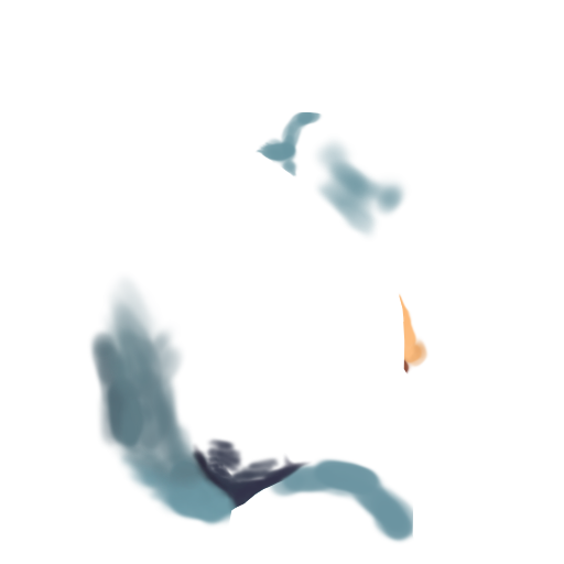
Here's that image again. Hover over to see the paintover applied. Click to see the paintover by itself. Not perfect, but far better than before.
Some things to note. I use a pressure sensitive drawing tablet. If you lack one of these, try setting the opacity of your brush much lower (maybe around 10%), and building up your strokes with repeated go-overs. Also note that this method works best with very flatly textured things, such as TF2 models. For more detailed things, clone stamping with color adjustment may have to be used.
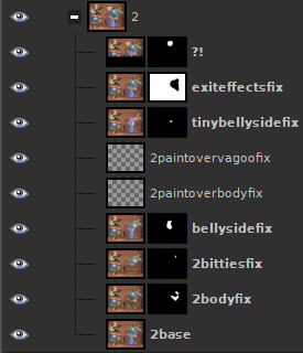
For completion's sake, here's the full layer setup of that image. Note that it's the second image in the set. Also note that a lot of these layers aren't strictly necessary for this; some details were added later, while others were split up to make editing easier. The topmost layer was even only present because I didn't feel like waiting for the poster to finish rendering!
HUD Elements
One other big use case for editing in post is adding HUD or other game elements to enhance the render, whether that's to help explain what's happening, or to make a joke stick better. How to do this will vary greatly depending on what game you're basing your render on (or if you're implying your own game!) Here's my general approach to it:
The first thing we'll want for adding a HUD element to a piece is to get a reference for the thing(s) we're looking to add. If you're like me, you have a lot of screenshots of the games you play. These can be a great source for references of different HUD elements. For example, on this piece, I used this screenshot as a reference. It worked out very well, having both the box with the funny "bug" in the post-death recap and chat feed with an achievement being earned!
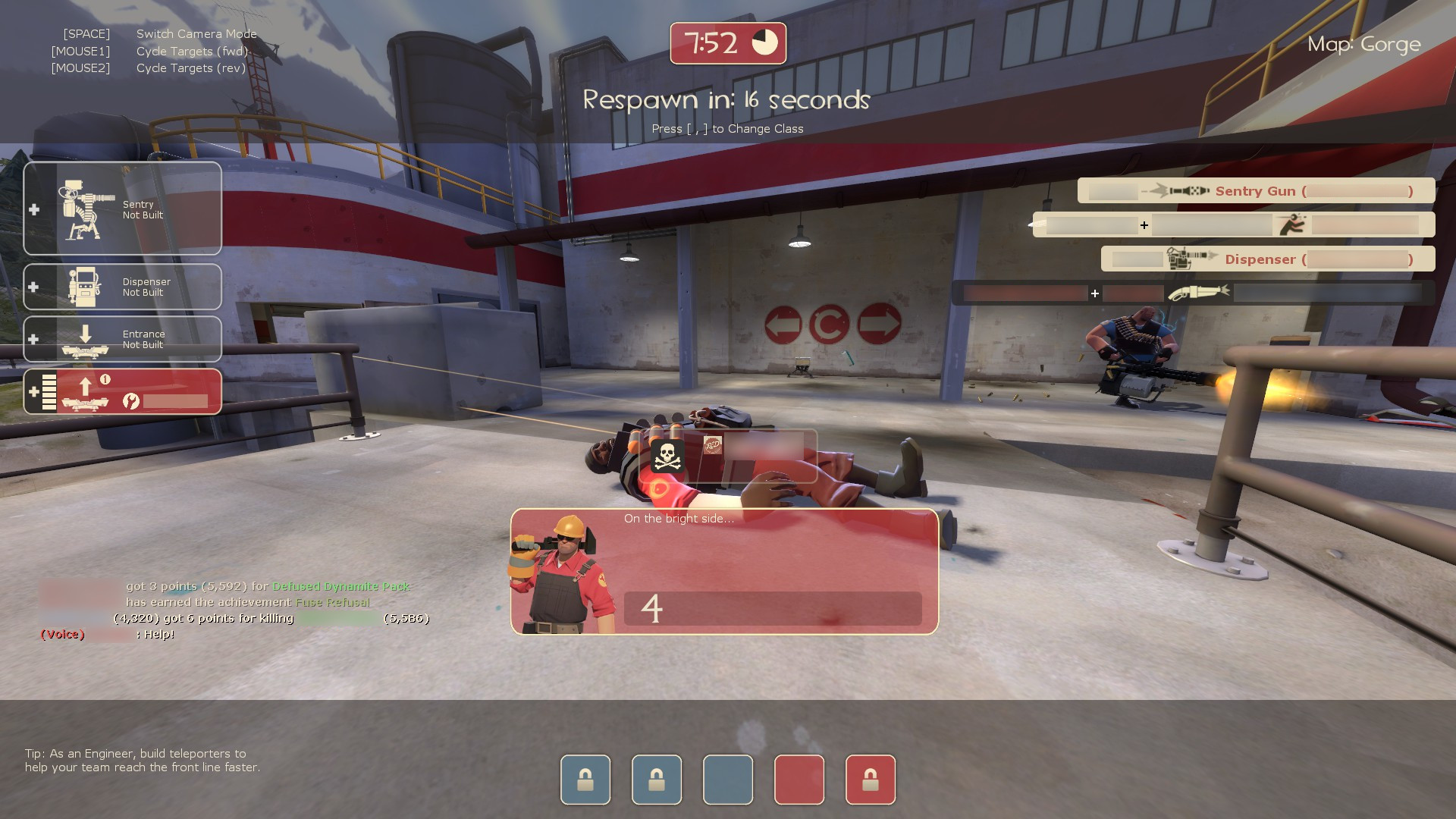
Games can be a great source of render ideas, too. That piece came about because three different people ended up getting that achievement off of me in one session (though, not all at once x'd).
Once we have our reference, we need to decide how we're gonna go about recreating it. Depending on how complex the element is, we could either remake it ourselves in our image editor, or pull the files from the game.
Finding the Files
Depending on the game, getting the files may or may not be possible. Luckily, TF2's are very easy to get, as they're already included with SFM. You'll need VTFEdit, and VTF Shell Extension, while not strictly necessary, will be very useful.
In your Steam library, right click SFM and go to Manage > Browse Local Files. In the opened folder, browse to the Source Filmmaker/game/tf/materials folder. The vast majority of the HUD elements can be found in the hud and vgui folders, while backpack icons can be found in the backpack folder. Main menu backgrounds are found in the console folder.
Open the texture file of your choice in VTFEdit. Go to File > Export and save this file somewhere you can find it easily, such as the desktop. This targa file can be opened in most image editors.
As for text, you'll want proper fonts. For TF2's unique fonts, you can find them in [Steam library directory]/steamapps/common/Team Fortress 2/tf/resource. Double click the font files to open their preview, then click Install. They should now be usable in the image editor of your choice.
For other Source games (or more recent additions to TF2) the process is similar, but you'll likely need to first get the files out of their pak files first. For this, you'll need GCFScape. Navigate to [Steam library directory]/steamapps/common/[game name]/[game abbreviation] and look for a pack file ending in _dir. Some games have all their files in one set (like for Portal 2 it'll be pak01_dir.vpk), while others have them split up. If they're split up, you'll want to look for a mention of "textures" in the file name (like for TF2, it'll be tf2_textures_dir.vpk). Some newer games, especially third party mods, will store their vpk files in another folder inside the game abbreviation folder. For example, TF2 Classified stores them in Team Fortress 2 Classified\tf2classified\vpks, where Entropy : Zero 2 stores them in EntropyZero2\entropyzero2\ez2. Whatever the file name may be, open it in GCFScape.
You'll see a folder structure that's loosely similar to the one in the SFM folders. Double clicking the folders will open them. Navigate to the texture you wish to see and double click on it to open it. You can also use the Find feature ( or Ctrl+F) to look for textures/folders by name. Typically you'll want to search with
 Match: Substring.
Recreating HUD Elements Ourselves
A lot of TF2's, and especially HL2's, panels are very simple. We can often make these ourselves (and, oftentimes, we need to make these ourselves due to how Source actually makes them in-game). For example, the health panel of Half-Life 2.
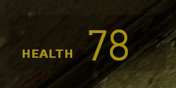
Nothing much to it. We have the smaller "HEALTH" text, the larger health value, and then a faint background for the panel.
Let's start with the background. It's a simple rounded rectangle, any image editing program worth its salt has this as an option. For GIMP, we use our Rectangle Select Tool, make sure Antialias is ticked on, and tick on Rounded corners. We simple draw the rectangle over that of our reference. Once we have it tightly against it, we can adjust the value of our rounded rectangle's corners to the proper value. For my screenshot that was at 1920x1080, looks like 8px is a good value. Now we can create a new layer and fill our selection in. But, what color do we use?

So, this background is partially transparent. It looks like it's black, but we're not 100% sure of that just from looking at the screenshot, nor are we sure exactly what transparency it's at. Luckily, most people aren't going to be too concerned if it's 100% accurate, so you can just fill it black and bring the opacity down some until it looks about right to you. But, if you care to know the exact value, that can be found.
For that, we're gonna have to dive into HL2's HUD files. Let's navigate to [Steam Library]/Half-Life 2/hl2/resources and open up clientscheme.res. Any plain text editor will do. Once we're past the comments, we'll soon start seeing the color definitions.
		"FgColor"			"255 220 0 100"
  		"FgColor_vrmode"	"255 220 0 200"
  		"BgColor"			"0 0 0 76"
BgColor is our background color, and it is in fact completely black like we thought. The fourth number is the alpha, also listed out of 255 like the other parts of the color. Most image editing programs handle layer transparency as a percentage, so if we convert 76/255 to a percentage we get just about 29.804%. GIMP only handles up to one decimal place, so we can round that to 29.8%. So long as we're here, we can make note of the text color, too. That'll be FgColor, which is RGB 255 220 0 with an alpha of 39.2% (or 78.4%, if you want to use the VR value).
Slightly further down we can find the fonts used in the HUD, too. There's a lot listed, but almost every one of them for actual text is Verdana (Bold, in fact, for reasons that are weird to explain, just know that this happens sometimes), while most numbers use the "hl2" font included in the files, which we can pretty safely assume includes our health label and value.
So, we slap a couple texts down using this information we know, and using our reference to both line them up and size them up. Your image editor might handle text slightly different than the Source Engine does, so if it's not 100% matching your reference, don't fret. Again, as long as you're close people will get the jist.

Besides, you don't always want to follow it exactly anyway. I find readability is improved by making the elements in my pictures bigger than they'd actually be in the game, especially the text. Or if you're doing fun things with them.
Oh yeah, and TF2 HUD elements are usually even easier, since they tend to only be transparent on little drop shadows. For those, as long as your reference is clear enough, you can safely just use your eyedropper tool to pick the colors directly from your reference. You may want to use Print Scrn rather than a Steam screenshot for this, though. Unless explicitly told otherwise, Steam will save your screenshots as jpegs, which tend to really butcher HUD colors!